f you’re mathematically inclined, the Golden Ratio may well be in your repertoire; if you’re a designer, you may already be using it to bring aesthetically pleasing structures and patterns to your work. Intrigued? As award-winning creatives, we can shed light on the methodology that’s said to have inspired iconic art and design for around 4,000 years and explain why its use is so important in signage design.
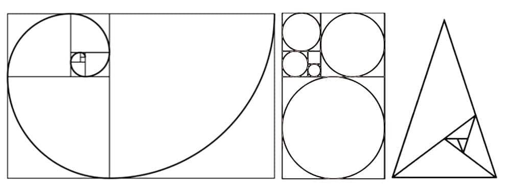
By way of an explanation of the theory, two quantities are said to be in the Golden Ratio if their ratio is the same as the ratio of their sum to the larger of the two quantities – it is a shape with a proportion of 1 to 1.618. As with the Fibonacci Sequence where a chain of numbers represents the sum of the previous two (0, 1, 1, 2, 3, 5, 8, 13, 21, etc.), if you continue with this ratio you’ll arrive at 1.618, which represents ‘the divine proportion’ – the Golden Ratio.
The square image below in the slider illustrates how the proportions for the small and overall rectangles remain the same after a change is applied.
To discover why signage systems can exploit the creative virtues of the Golden Ratio, we should go back in time. The pyramids built by the Ancient Egyptians and the Acropolis of Athens constructed by the Ancient Greeks all used the Golden Ratio to set the dimensions of their structures, columns, porticos and pediments proportionally across each building. You’ll also see it in the structure of the Mona Lisa and the Eiffel Tower and in nature too – from the florets of a flower to the scales of a pineapple, all are proportionally perfect.
Its influence continues today with a raft of Golden shapes that we have at our disposal, including Golden Circles, Golden Spirals and Golden Triangles used by gifted designers who apply Golden shapes to contemporary compositions from printed materials to web pages – albeit with less precise proportions. The layouts created by arranging visual elements on the page and structuring column widths, sidebars and grids deliver impact, balance and visually appealing form.
In wayfinding signage design for example, there’s an order, or hierarchy, that instantly communicates the most important information first in a way that is clear, concise and reflects the brand. The Golden Ratio can be used to determine the most suitable text size – for example, a location subtitle with a point size of 16 will perform most naturally with a location title of point size 24.
You’ll see icons across many of our signage schemes at Signbox. Our internal signs and external signs, including fire and safety signs, room signs and Marcal signs all rely on simplistic, aesthetically-pleasing iconography – by applying Golden Shapes properly, proportions and structure will all sit perfectly within their own space.
You only have to study the proportions of the distinctive Apple logo and see how Golden Circles have been applied to the leaf and the bite to create a mesmerizingly simple, yet highly effective logo. We use the Golden Ratio to position our client brands’ logos on a signage design whilst making the most of curves, lines, scale and other elements in the space to draw the eye across the sign to absorb every feature in a clear, coherent and memorable way.
So, it’s clear that, by applying the time-tested theory of the Golden Ratio to signage design, we can project balance and harmony to all elements of a sign. The templates we create for many of our fire and safety signs and clients’ bespoke branded signs become more familiar, welcoming and unforgettable. When it comes to wayfinding signage and other workplace signage schemes, these are often subliminal, yet essential qualities.
If you’d like to know more about perfectly designed architectural, interior or exterior signage schemes, please contact Signbox on +44 (0)1784 438688 or visit signbox.co.uk.
Signbox Limited
1-3 Egham Business Village
Crabtree Road,
Egham
Surrey
TW20 8RB
This site is protected by reCAPTCHA and the Google Privacy Policy and Terms of Service apply